Say Hello to the New and Improved Mildred’s Temple Kitchen Brand
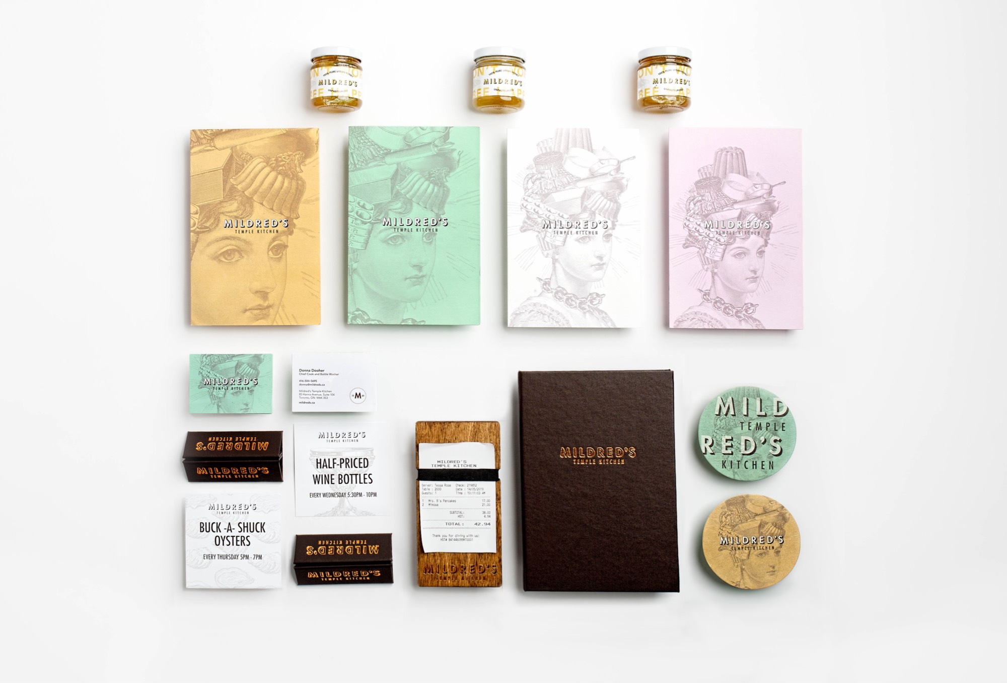
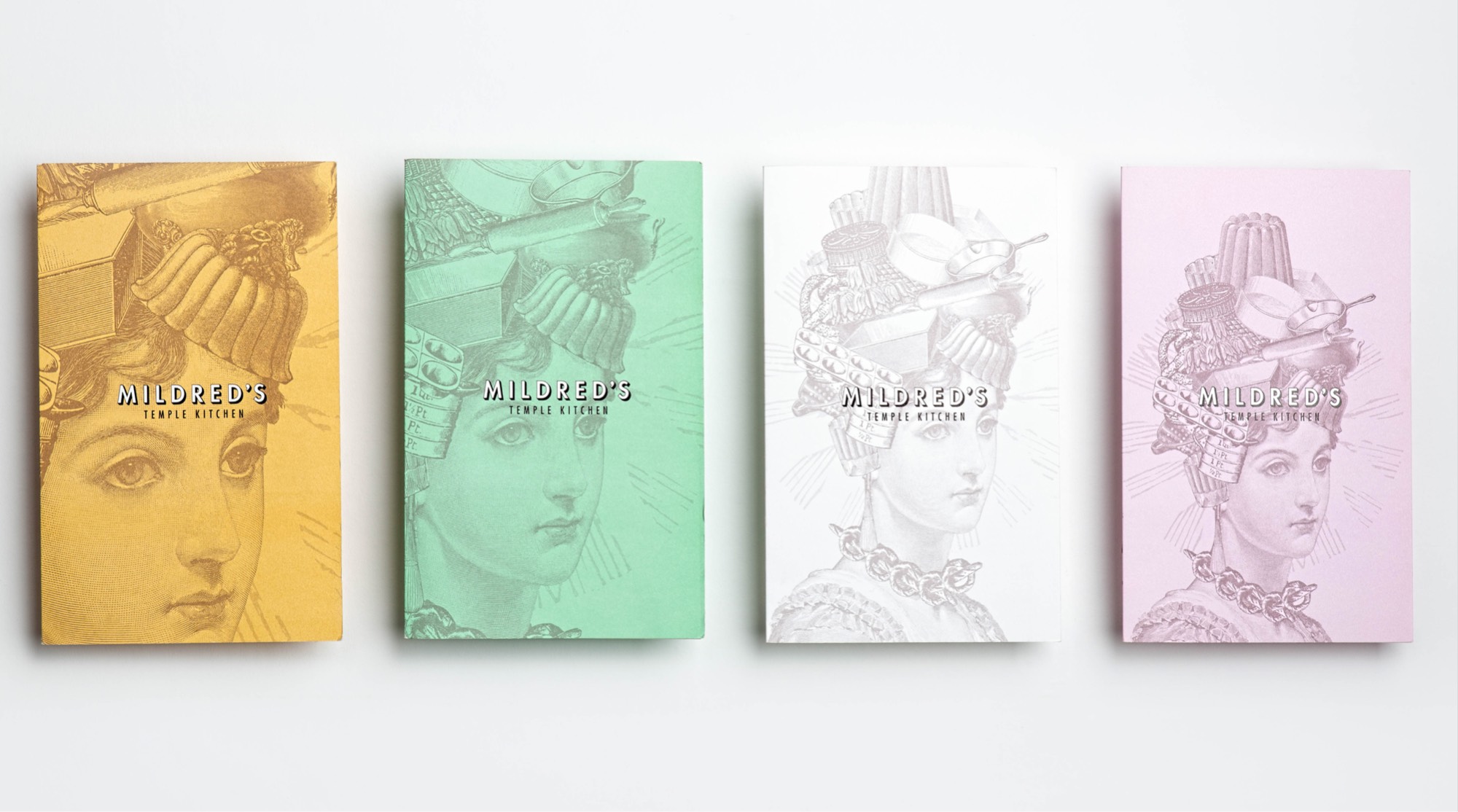
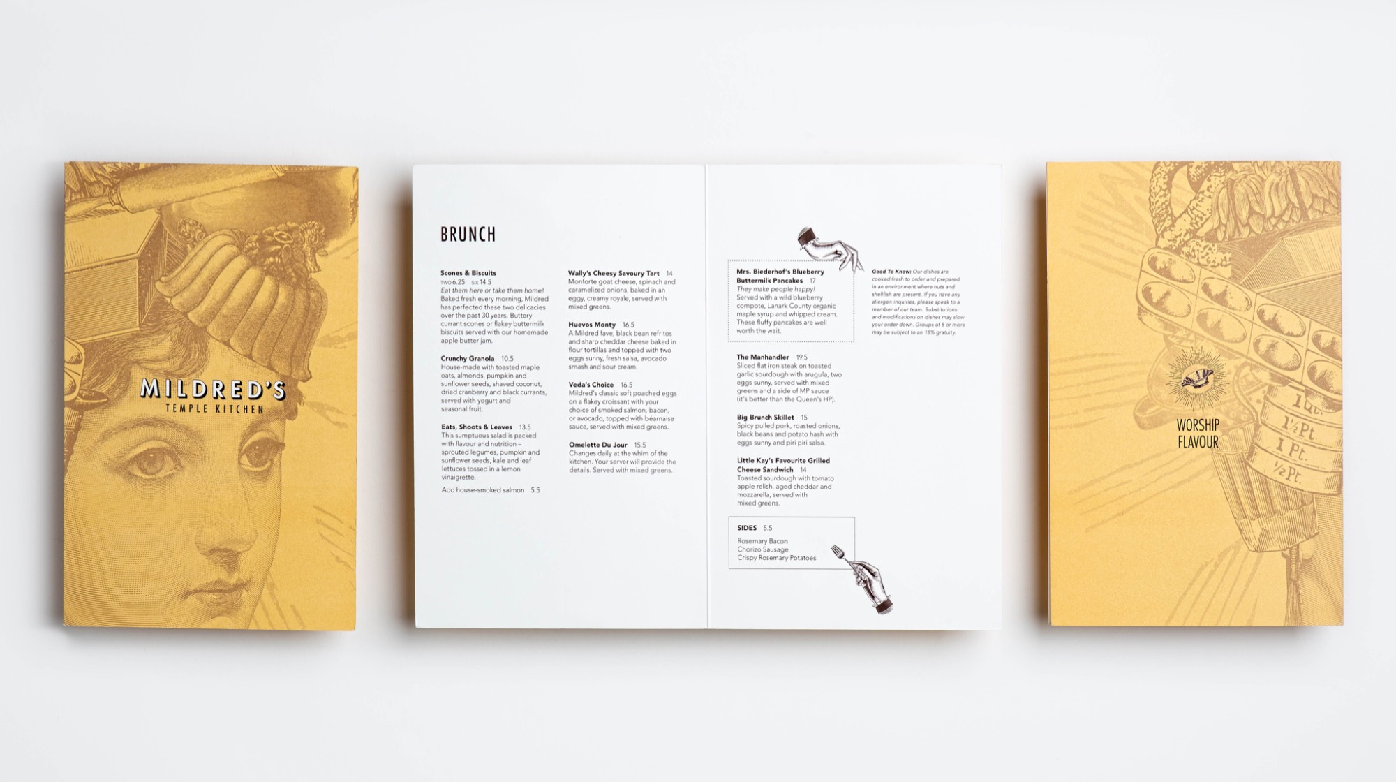
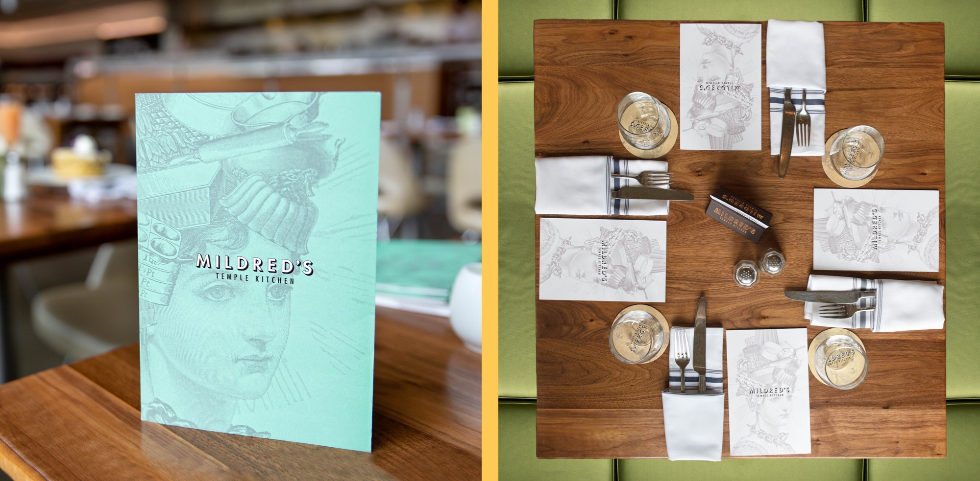
We’ve recently given Mildred’s Temple Kitchen a facelift, recognizing that the old brand we created 20 years ago for Mildred’s was a little too complicated for today’s minimalist style. Mildred’s new look is a more streamlined version of the old brand – and we have to admit – we love it!
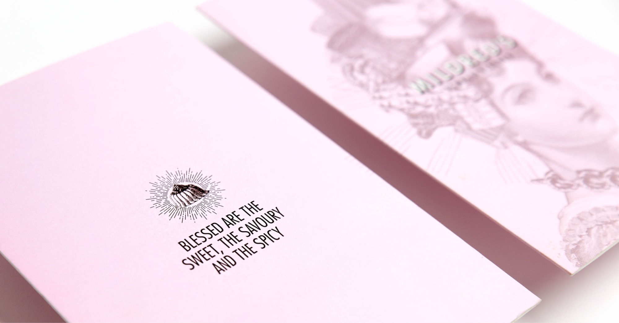
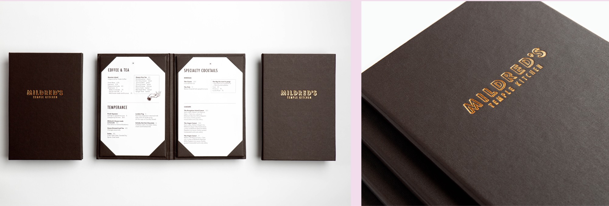
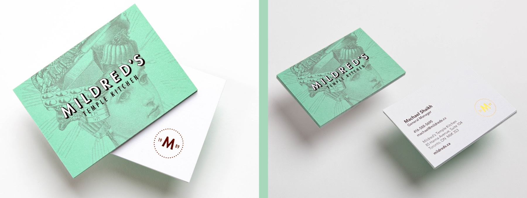
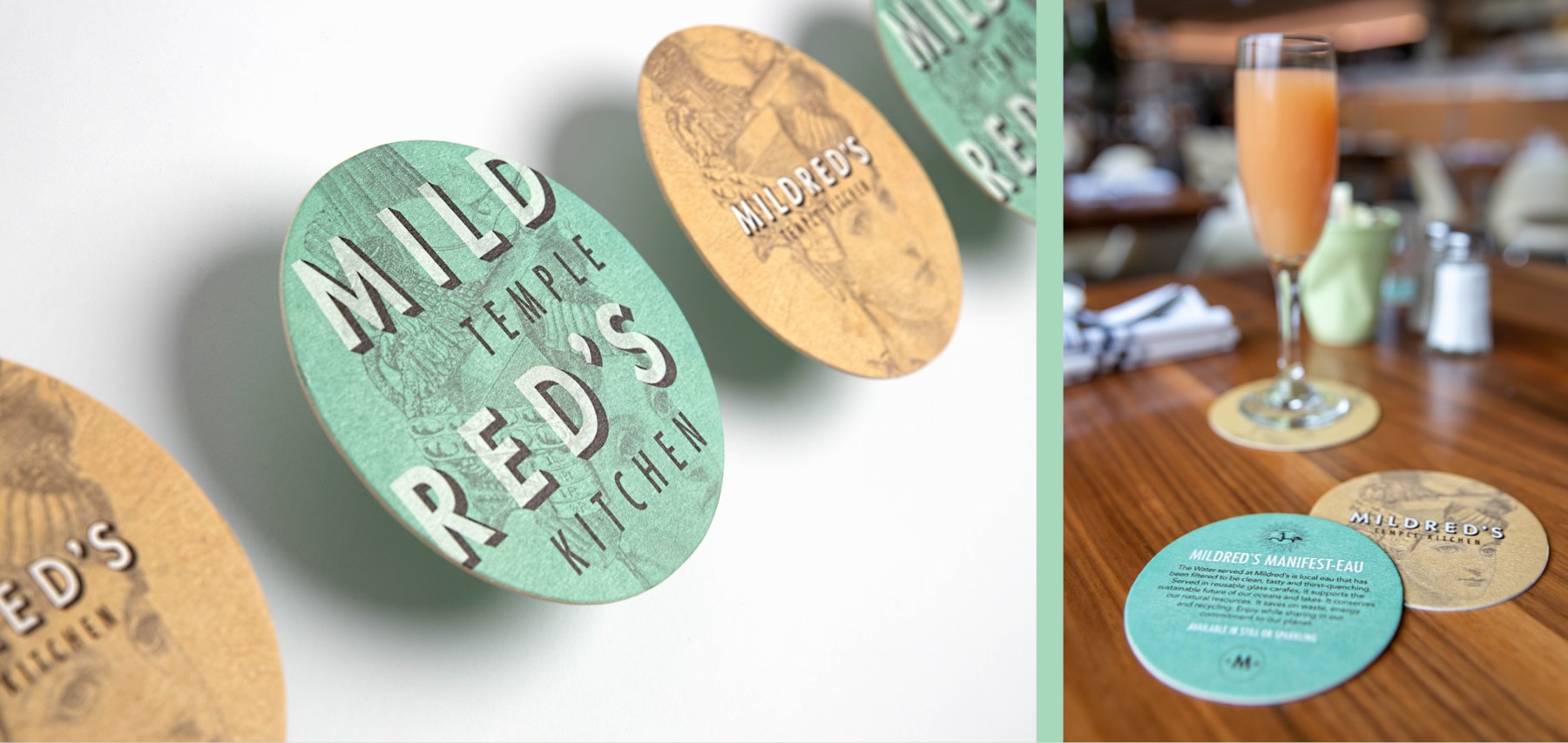
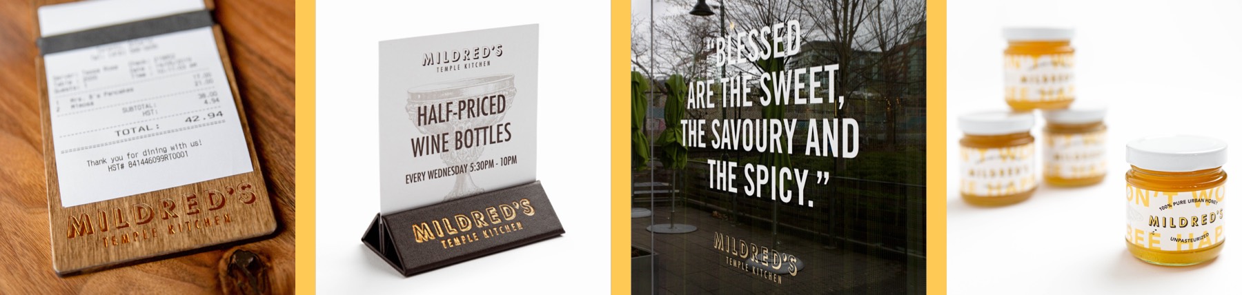
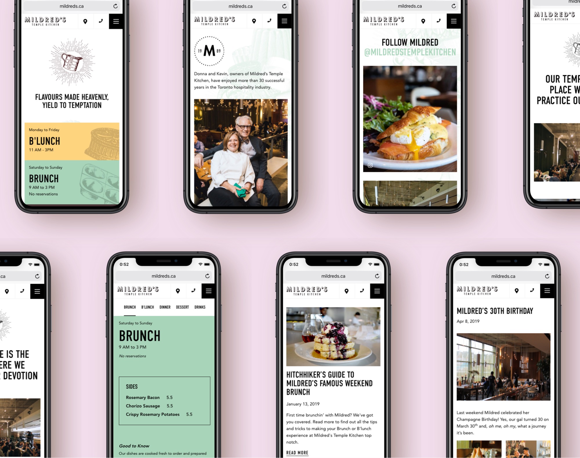
The new design puts more emphasis on bold typography with less moving parts. Our designers focused on creating a strong wordmark for Mildred’s with less emphasis on Temple Kitchen. The new Mildred’s brand is bold and sassy – like Mildred! The colour palette has undergone a paradigm shift as well – it’s a more elegant derivative of the original – it’s softer, warmer, more pleasing to the eye. Part of the design includes a monogram companion stamp which speaks to the legacy of the brand and acts as a signature or a stamp of quality. Overall the new branding strikes a balance with a strong wordmark and light colour palette and a simplified illustration of the Mildred’s goddess.
Client
Mildred’s Temple Kitchen
Website
www.mildreds.ca
Role
Branding
Strategy
Collateral
Sales Centre
Signage
Website