A New Brand That’s All About Love
For over 25 years, Forest Hill Montessori School has been in operation. Initially located in Forest Hill, one of Toronto’s most upscale neighbourhoods, the school moved out of the area several years ago. But the name remained. Over the years, FHMS has grown into a thriving school with classes from toddlers to middle school. It enjoys an excellent reputation and caters to a fairly elite clientele. With a long waiting list to get in, expansion is in the air.
The founders and principals of the school came to us to talk about a potential rebrand. They were looking for a new logo to take FHMS into the future. This was a bold move for them. They loved their logo but knew that it was time for a change. They had no idea what was in store!
As part of our process at 52 Pick-up, we do a deep dive into the strategy that impels a re-brand. In order to provide our clients with the kind of intelligence that helps them make changes and decisions, we offer a very detailed and systematic style of research.
For FHMS we presented a thorough investigation into their goals, the process, vision, mission, values, SWOT analysis, target market analysis, competitive landscape and brand positioning before we tendered our observations and conclusions.
We concluded that a rebrand of the existing name/logo was not going to be the best direction for the school’s future. We felt that a name change was necessary – a name that more accurately represents the forward-thinking philosophy of the school – a name that is edgier, less traditional, a unique name that parents and students will be proud to associate with, a name that is “cool” – and a name that is adaptable to other locations – in Toronto or anywhere in the world.
And so we set about the process of creating a new name for FHMS.
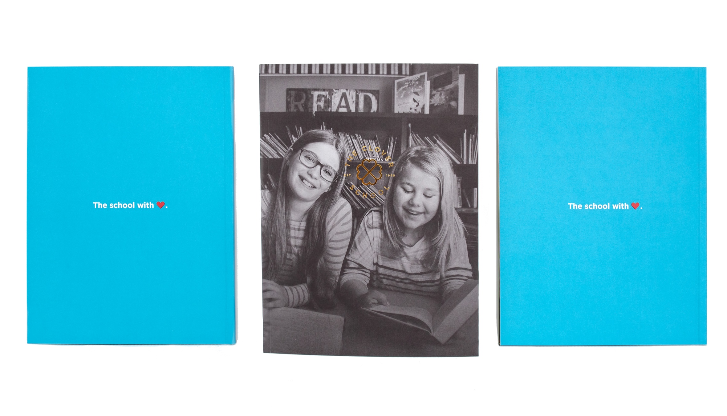
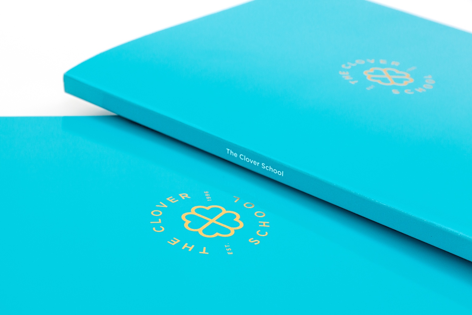
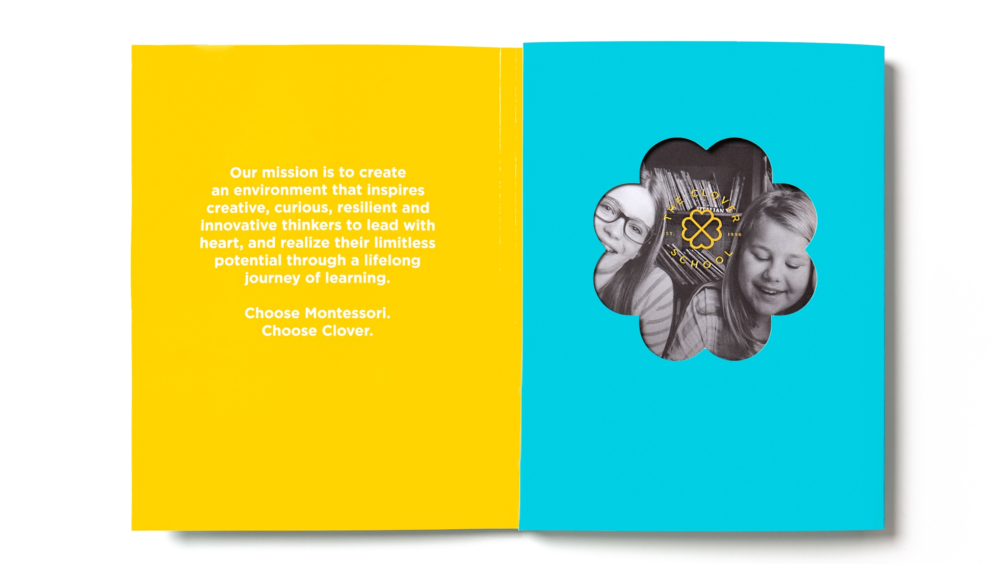
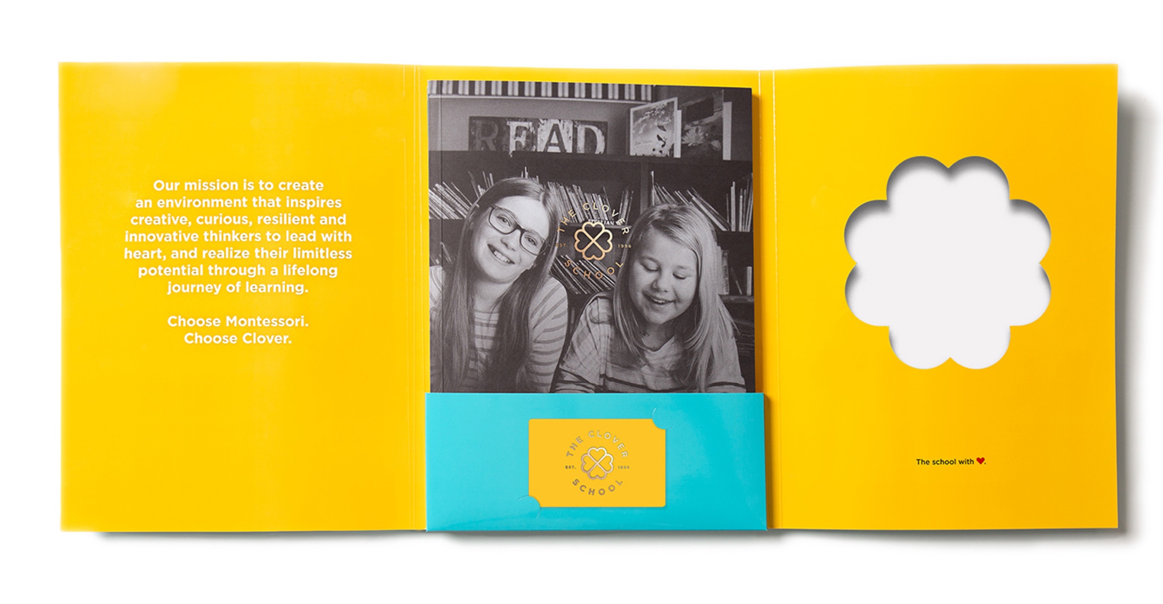
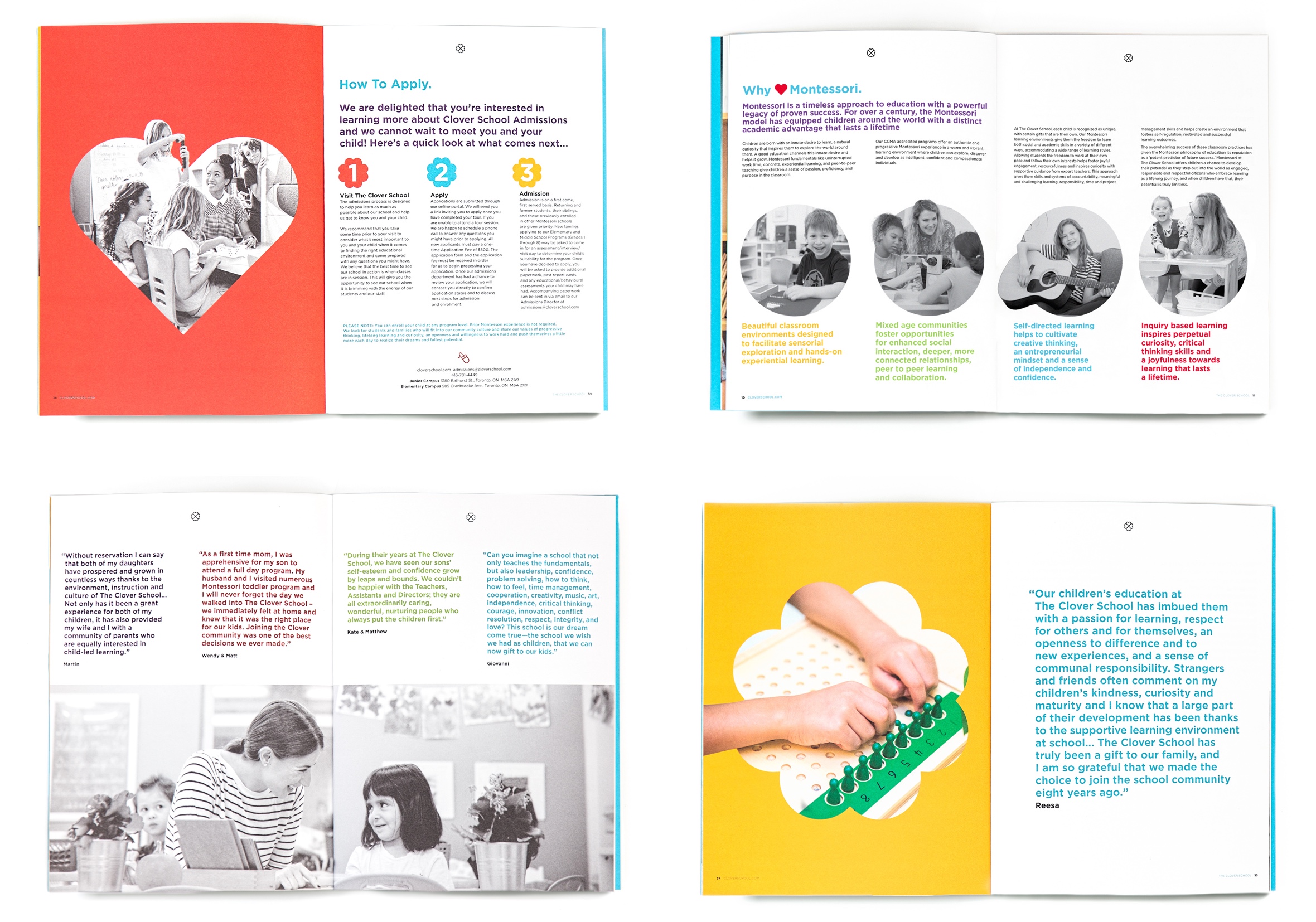
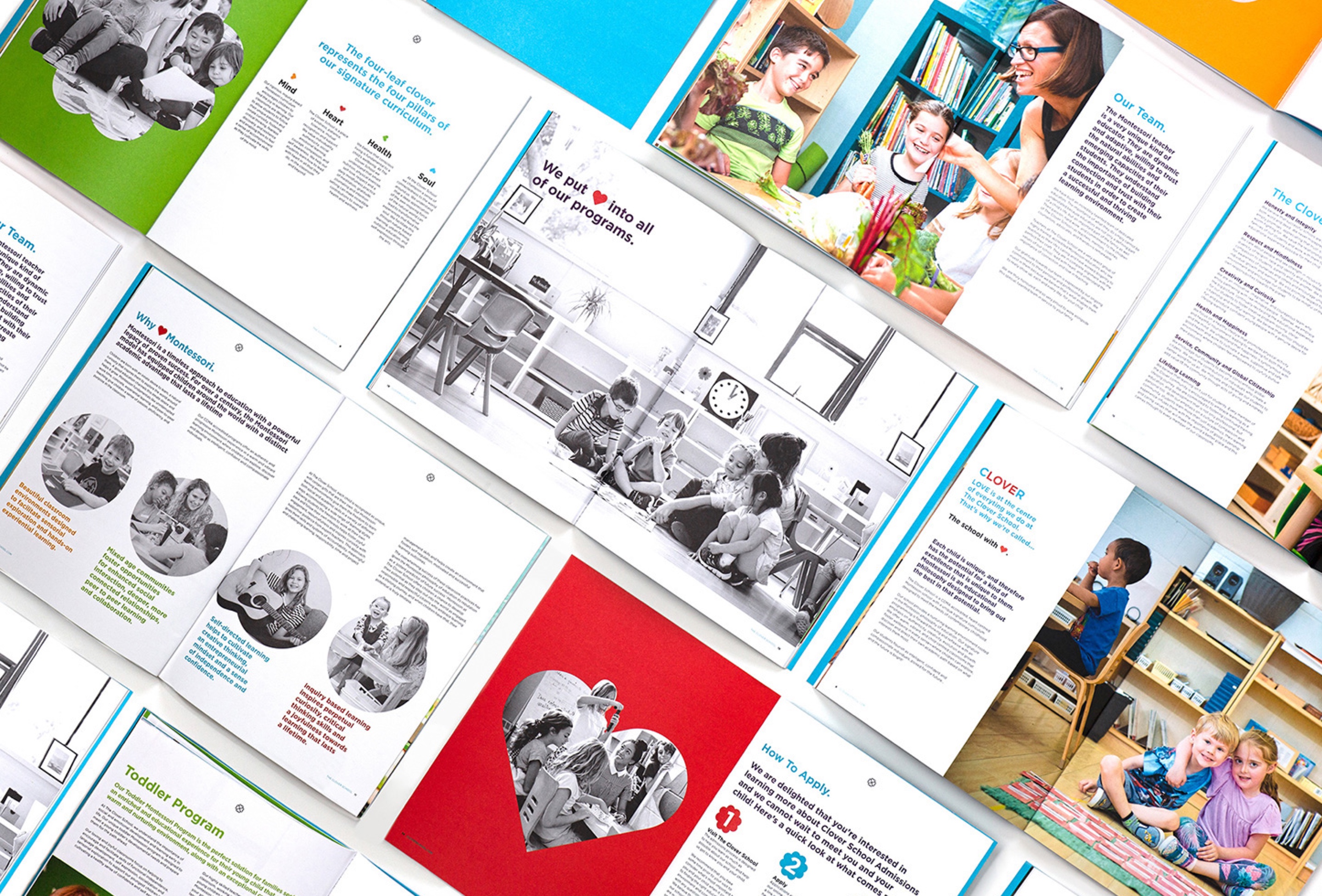
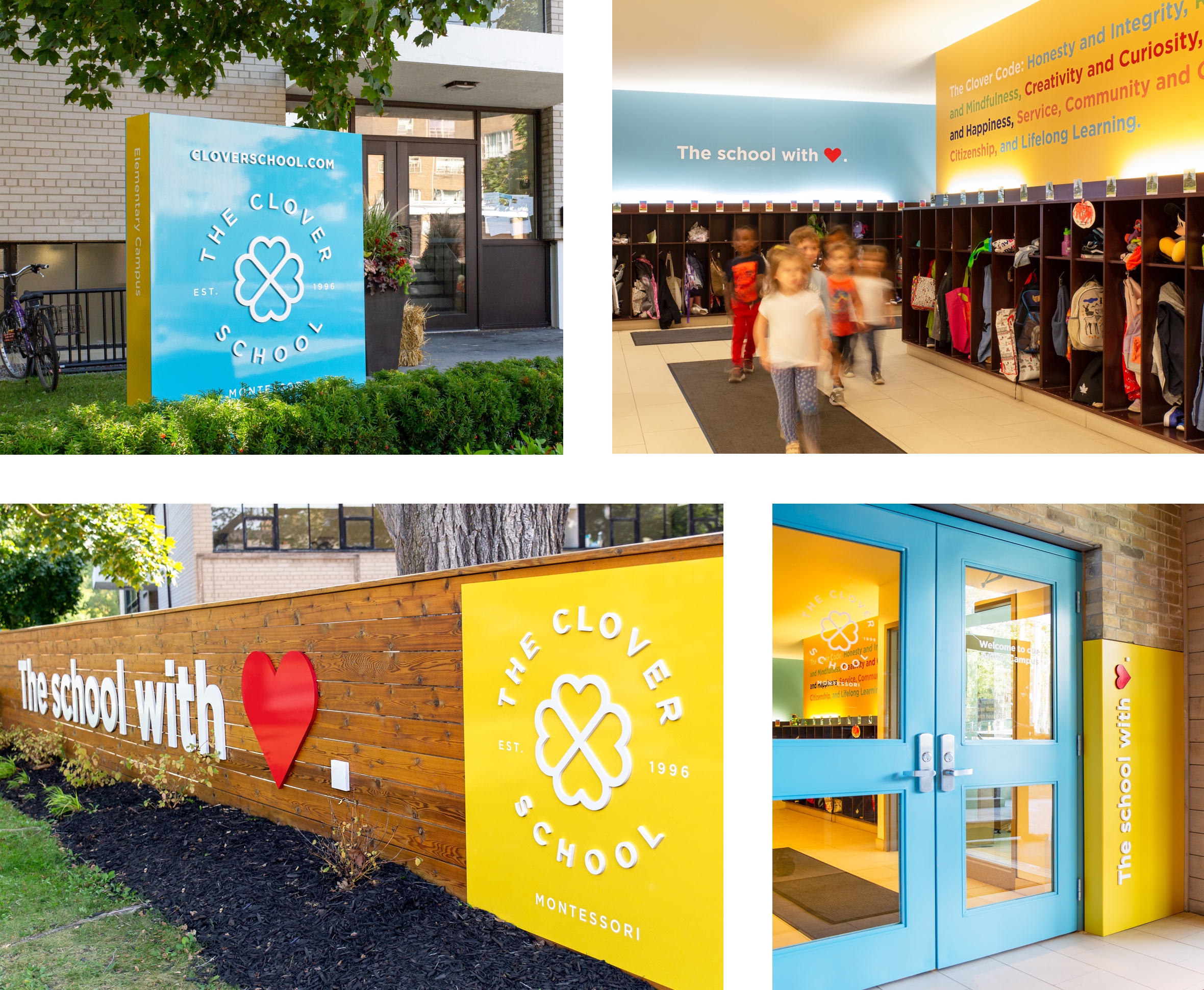
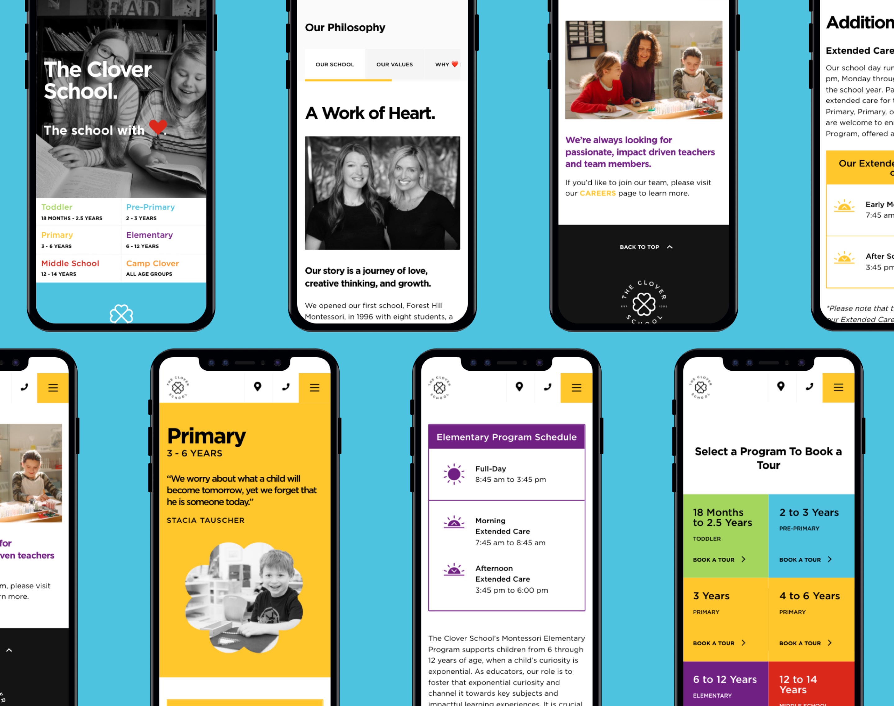
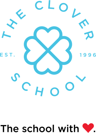
We knew we had hit upon a winner when we came up with The Clover School. Clover reflects many of the attributes of the school. It is a fabled icon of folklore that epitomizes the rare four- leaf clover as a symbol of luck. In relating Clover to the Montessori experience, it shares numerous similarities: Each clover, like each student is distinctive and different. Each clover is compelled to grow upwards towards the sun to achieve its nourishment. If you look closely at the shape of a clover, each of its leaves is distinctly heart-shaped which symbolizes the nurturing, safe and loving environment that the school provides. And imbedded into the word CLOVER is LOVE – the USP that this school is all about.
Needless to say, our client loved the name – we all did! Our creative department jumped into design to create a brand for this exciting new name. The results, as the saying goes, speak for themselves. The logo is fresh, fun, cool, young – all the things that we believe are embodied by The Clover School.
Client
The Clover School
Website
cloverschool.com
Role
Branding
Strategy
Collateral
Signage
Website
Environmental Design